The Colour of Summer
The Colour of Summer
From our UK Design Manager Nina Bailey

Colour inspires everything that we do. Our heritage, which is deeply steeped in colour and design forecasting, gives us the experience and know-how to be confident that we know what we’re talking about when it comes to colour. Our global design team ensure they keep on top of the latest trends through working with our colour forecasting partners and are continually monitoring key industry sectors that are lead indicators for interior design.

With a passion for colour and a wealth of knowledge under our belts we’ve decided to create a series of colour stories that we’ll be sharing with our readers right here on our new blog!

In our first instalment of our new series we’re interested in 2018’s colour trends. We caught up with our UK Design Manager, Nina Bailey, on which colour palette is at the forefront of the design world this summer season.

The colour palette prepared by Nina is not just about one specific colour but how they work together to create an understated air of summer time elegance. We’re seeing summer colour palettes move away from the obvious bright and bold colours of the past and are instead an amalgamation of light shades and natural tones.

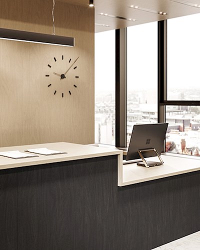
Nina has carefully handpicked each colour for this seasons palette, as pictured. It includes: Pale Olive F3007, Grotto F7846, Opal F2966, Ocean Grey F7853, Just Rose F8858 and the palette is accompanied by Natural Ash F8843.
Nina believes: “Taking inspiration from observations and findings at recent European shows combined with my own palette building experience, the colours selected have been chosen based on what I believe is now a usable and trending summer palette. Moving away from the obvious bright tones of this season, I have selected a semi organic array of tones with a colourful twist. The palette has a base of green, Ocean Grey, Opal and Pale Olive, all of which work harmoniously together and add a sense of nature. In contrast, the Just Rose sits on the other side of the spectrum giving a warm peaceful balance while the teal tone of Grotto is the darkest colour, it grounds the palette and gives an edge to the overall look.”
Discover the Formica Colors collection and follow the story on Instagram and Twitter using #FormicaColorsCollection.